|
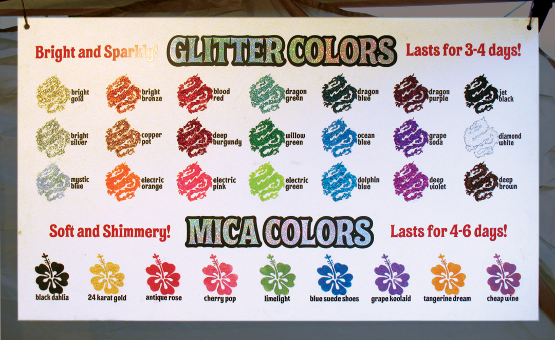
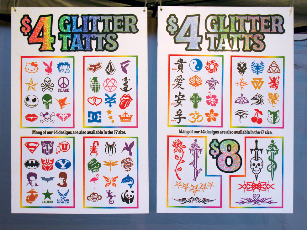
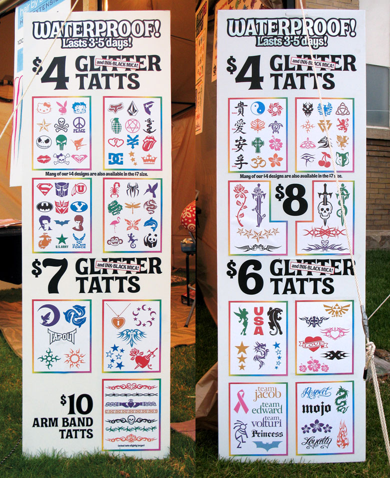
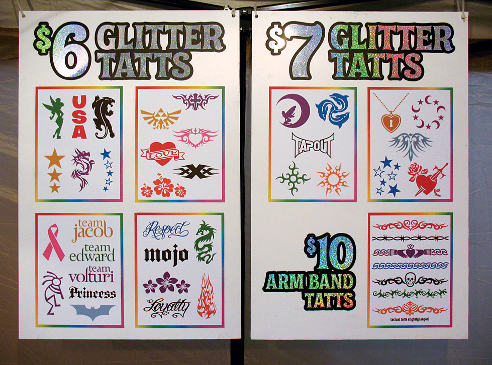
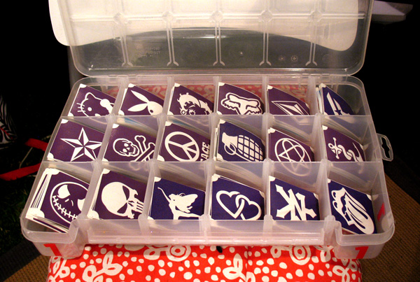
We've been asked for some photos of how we display our designs and how we organize our stencils at events. The first thing you need to realize is that we're INSANE here; we go to kind of extreme lengths with the display posters simply because we have the resources to do so! We're not going to recommend that you go to all this trouble, but if you WANT to, we'll be happy to help you do so. The storage boxes we use were a happy accident. We had originally come up with the small stencil size as the most efficient use of materials; but found that these craft storage boxes from Walmart had slots EXACTLY the right size! The stencils fit almost exactly side-to-side, but lay diagonally for easy access. Pulling every other divider out makes the slots the right size for medium stencils too. The posters have the title lines and prices permanently applied, but the designs are on separate sheets of card stock that are adhered with spray mount. That way, we can change out and update designs. You can't see it in these photos, but each row of designs has a tiny pale number beside it that corresponds with the storage box that those particular stencils are kept in. So, looking top to bottom on the tall posters, those stencils are in boxes that are stacked that way on their storage shelves. It only takes a few seconds to see what row the requested design is in, and then pull that storage box out and locate the stencil. (We pop the tops off the boxes once we're set up.) You can see that we seem to repeat the posters, but what we're really doing is having an indoor and an outdoor version. The tall posters sit outside the booth, attached to our tent legs; this is what attracts the public's attention. (Plus it's easier for small children to pick designs lower to the ground!) The second set of posters is an exact duplicate, but they're inside so a client already in the chair doesn't have to get up and go outside to make a decision. It's also better for traffic, since two groups of people can have access to all the designs in two different locations. Which brings us to a few rules we consider really important as far as displays go. #1 - NEVER let the public have access to your stencils. That's why I think flip books or even charts with pockets of stencils are a bad idea. #2 - Try to show a positive design instead of the stencil itself, because ultimately that's what the client is getting, and negative images can be deceiving. Plus, I always reproduce the designs at their exact size, so the client knows precisely what they're getting. (Except for the armbands, but I explain that they're slightly larger than shown.) #3 - A flip book of photocopies or even scans of the designs can only be seen by one or two people at a time. If you want to have several flip books of this kind, that's better, but large displays that aren't monopolized by a handful of people are a much better selling tool. Our outdoor posters can easily be spotted by a client 20 yards away. #4 - The more you can show, all at once, the better chance you have of selling. Oh, and the glitter chart . . . a little more insanity, but we like it. It took us a couple of hours to produce (figuring out how to get the glitter to stick to the plastic sign material was REALLY tricky!), but it REALLY saves time and again, it's a great selling tool. A lot of people just show their poof bottles to clients, but it's hard to really see the colors that way. And we figured that showing an actual design with glitter was more interesting than a solid square or circle. Do you think you'd like to be as insane as us, and want help in crafting your own similar displays? Just contact us, and we'd be happy to help you! |
SHOP
Custom Design Services Purchase Additional Postage Displays & Signage FLASH-LOOK TATTOO STENCILS STICKY THINGS! MY COUNTRY Down Under - Oz & NZ Fairy Wings, Chokers & Tiki Charmers Holidays & Special Events Minis and Specials Small Stencils Medium Stencils - Horizontal Medium Stencils - Vertical Large Stencils Long Stencils NEW! ShortBands NEW! KidzBands Armband Stencils Promotional Help SPECIAL ORDER PAGE Mini Zodiacs|
Advanced Search |
|
| Show Cart | |
|
Your Cart is currently empty.
|
